Having said goodbye to the man from the landscaping company, we were then free to explore the house. On the outside, about half the grey mortar had been covered over with the outside, coloured layer. Finally we could see what colour our house is going to be!
Well, not exactly. Unfortunately, the coloured mortar was not yet dry which means that what we were seeing was a shade darker than the final colour. We actually liked the darker shade quite a lot! I guess it's lucky in a way that we didn't have the option to "pause" there and take the darker colour - whether to do so or to stick with our original choice and go lighter and brighter would have been a difficult choice. Thankfully, that's all hypothetical due to the laws of chemistry and physics so we will have to cross our fingers and hope we like the light mortar as much (I'm sure we will!)
Inside, there were quite a few changes, the major ones I will describe briefly below before the usual photodump at the bottom.
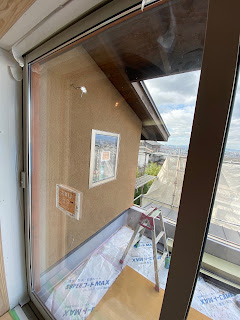
So here is the colour of the mortar as it was on Saturday afternoon. As mentioned above, it is going to get a fair bit lighter than this as it dries. This area was getting a reasonable amount of light though, so any shaded aspects of the house are likely to have a similar hue. I think it works quite well with the shine grey window frames.
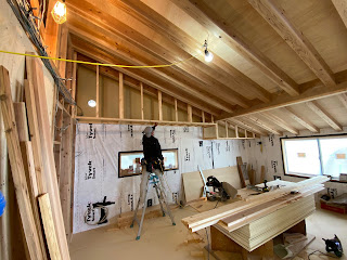
Here, one of the workmen is putting up the kind of "false wall skirting" which will go around the top of the room. This will be used for cabling and ventilation as well as the ducting which will cycle heat from the upstairs back downstairs using a fan system. This allows the house to re-use warm air in a cycle.
The skirting extends about 60cm out from the wall, partly at about 195cm height (in the far RH corner) but mainly at about 230cm. It will just look like wall when it's finished. It's a shame to lose some of the sense of space in the upstairs area but, then again, we wouldn't have even thought about this if we weren't building the house from scratch. These major details just dissolve into a completed house. I guess we are lucky that we get to experience both the before and the after and it will be interesting to see how this changes the feel of the room.
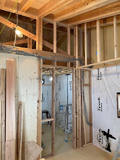
Finally the other side of the doorway is framed up for the pantry. The doorway is not as narrow as feared and just the simple addition of this framed part makes it feel more like an enclosed space.
The walk in closet that separates the study and the master bedroom is finally being built. This will house the sliding door on the study side. It will be very different once these three spaces are finally separated. The study and master bedroom can be swapped around at a later stage if we want to (since the Walk In Closet has two entry points). In hindsight, this was actually a very clever idea! Well done us!
At last! A completed ceiling. This is what the study looks like. The sloped roof is very noticeable and may take some getting used to. I wonder if it will be as obvious when the room is full of stuff and fully functional. That said, I am currently sitting in a room I sit in every day and can't imagine what the ceiling looks like without looking up so maybe we won't notice it as much as we think.
Here's the new access they have built to the upstairs toilet. Previously the bit on the left was missing so it looked like all one big toilet space without the "corridor". I quite liked the "big toilet" but Yuko said it was weird to have a toilet door right at the top of the stairs, even a sliding one. The toilet corridor is growing on me. We can put a nice picture on the wall at the end.
Right, that's the major bits taken care of. Below are a few more captioned photos. We'll be at the house again this weekend so will take some more photos. Speak soon!
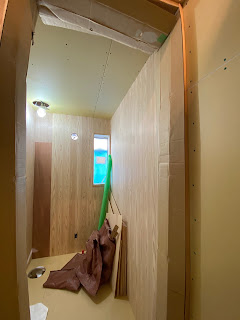 |
| Inside the new, smaller upstairs toilet |
 |
| Walk in closet space (far end), large storage cupboard (near end) |
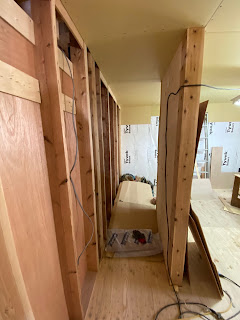 |
| Corridor alongside kids bedroom (RHS) |
 |
| As above but from study (soon to be closed off) |
 |
| Other corridor towards back door |
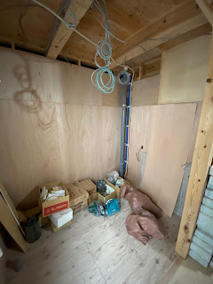 |
| Laundry room |
 |
| Bathroom prep area (脱衣所) |



No comments:
Post a Comment