Greetings
all. For those in Japan, I hope the summer heat isn’t causing you too much
trouble. We’re up to the high twenties here in Osaka but the worst is certainly
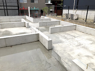
yet to come. It’s been rather quiet on site lately as we are waiting on the
wood for the house frame to arrive and for a break from the recent rainy
weather to build the concrete base above the foundations on which our house
will sit.
The
groundwork and a few other things have delayed us a bit so we’re now looking
like November for our completion date. We were hoping to be in before the Rugby
World Cup, as the stadium is nearby and we have tickets but unfortunately, it
was not to be. Ah well, what’s another few weeks eh?
Whilst
the last couple of weeks have been pretty wet and miserable, we have at least
been able to make some decisions about materials and finishes for the outside
of the house. Obviously it’s not built yet (!) but I have a few sample pictures
which I’ll include below to give you all an idea of what it might look like.
The main focus today, however, is the windows...
I’ll
start by saying that choosing window frames involved a huge amount of
deliberating and compromise both amongst ourselves and also with the builders. We
are having LIXIL Thermos (in Japanesified English, Samos) windows fitted since they are double glazed and relatively
inexpensive. You can see more about them here. This gives a choice of both internal sash colours (to be discussed
in a later blog) and external sash colours. Double the fun!
Yuko
and I had been given a small sample to look at and had provisionally decided on
“Shine Grey”, a kind of dark and, oddly, not especially shiny grey as the exterior
frame/sash colour for all the windows. Since there are two LIXIL showrooms in
Osaka, it was pretty easy for us to drive over to one of them and have a look.
We were very positive and excited to go and have a look at our new windows.
Then
we encountered our first problem. I didn’t like Shine Grey. To me it looked
cheap and flimsy under the bright lights of the showroom. I didn’t like the
other options much either, with one exception. The black frames looked smart,
sturdy and, from a distance, they could have easily have been made of wrought
iron instead of the lightweight aluminium that they are really made from. They
seemed rather neutral and cool. I could imagine them aging well.
Yuko
didn’t like the black frames. Oh dear! Problem number 1. What to do? We asked
the shop assistant for help and she told us that some people like black frames
and some people don’t. Not especially helpful. She then showed us a mockup on a
computer screen with black frames and then grey frames, which didn’t really
look anything like our house. Again, not the breakthrough we were hoping for.
This was becoming an issue.
We
wandered round a few more times but it was pretty clear that we were at a bit
of an impasse. I kind of agreed that having all black frames for the whole
house would be a huge decision but I couldn’t really see any alternatives.
After rather a lot of pacing and not a whole lot of constructive commentary,
Yuko announced “We have a big problem”.
It was hard to disagree.
Now,
since I am a super husband and all-round reasonable man, I had reluctantly told
myself at this stage that I was likely going to have to accept the Shine Grey
all over the house. Of course I couldn’t tell Yuko that! That would be akin to
pulling out the white flag and I still wanted at least to discuss it a bit
more! Negotiations continued.
Then
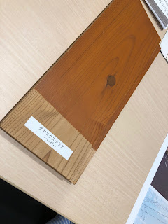
I had a bit of an idea. The lower part of the front of our house is going to be
clad with Japanese cedar in a kind of orange stain which should weather into a
kind of darker burnt orange hue. The top part is going to be finished in a
white-ish mortar with a small amount of yellow added. Whilst I had accepted
that the Shine Grey frames looked reasonable against white-ish backgrounds as
the two colours blend together reasonably well, what I really didn’t like was
the way the Shine Grey looked against the stained cedar. Black looked much
better I think. It could also pair up nicely with a black door handle on the
wood front door and the darkness of the roofs above. I felt that this would
create a kind of cool wooden ‘wrap’ effect around part of the ground floor of
the house. Perhaps you can see where this is going...
We
asked the lady at LIXIL if people often have different window frames for
different parts of the house and she said that they didn’t really. This didn’t
bother me (us?) as we aren’t trying to build a 100% typical Japanese house like
the ones you get from the big homemakers. In a way, we are trying to build
something that incorporates both of our cultures (although that’s certainly
more difficult to do with the outside than the inside). A plan was developing.
At
home the discussions continued with lots of Google image searching for examples
and inspiration. At one stage, I think I had about 70 tabs open on my computer.
Conversation ebbed and flowed but I sensed that we were starting to come
together towards consensus. Perhaps I could put the white flag away for good?
After
more than a day of discussion, we finally opted for the bolder option of having
black window frames on the cedar part and Shine Grey for the mortared walls. We
sent our decision off to the builders with a couple of the pictures we had sourced
to explain the concept. They responded to say thank you and that we would speak
about it at the next meeting.
At
the meeting, we went over the various choices we had made and the conversation
turned to the windows. Japan is pretty conservative when it comes to these
things and conformity is certainly the norm. Doing something that others don’t
is perhaps seen as a bit eccentric and a bit individualist. As such, our
architect described our two (small) black window frames as rather “kitsui”, loosely translated as intense, bold, or striking. Negotiations had re-opened and this time with a different
adversary. This being Japan, several long and uncomfortable silences ensued!
Yuko
did a grand job of mediating between us and eventually it was agreed that we
would in fact go with the more striking
option. I (and perhaps still to a lesser extent), Yuko have faith that the
black windows are going to look good and, at the very least, in a world of
conformity, it will make our house a bit unique.
All
this fuss over two small windows! We’ve lived at our current flat for over 3
years and I still couldn’t tell you what colour the frames are on the outside. Still,
I’m really glad that we took the time to really discuss it together, as
difficult as that was at times, and presented our decision to the builders as a
team. If it looks awful, I’ll have to suck up my pride and find some
replacement frames or get the paintbrush out.
I
think that’s a good point at which to draw this entry to a close. In other
news, there’s going to be some concrete work on site in the next few days so
hopefully I can get some pics up early next week. I’ll also try and get something
together on some of the interior decisions we’ve made lately. Tiles, toilets
and the like. As always, we really appreciate the ongoing feedback, commentary,
shares and likes. We’re closing in on 10,000 views which is just absolutely
insane. Thank you all for taking such a keen interest.
 |
| The sash colour options. Interior are on LHS, exterior on RHS. |
 |
| Cedar wood cladding which will feature the two black windows. |
 |
| Mortar options - we will probably go for something like the one right in the middle. |
 |
| An "inspirational" picture which shows the look we are going for. |
 |
| The only picture I remembered to take in the showroom despite spending hours there! |


